Portfolio
Jellyfeet
Brand
Colatteral/Marketing


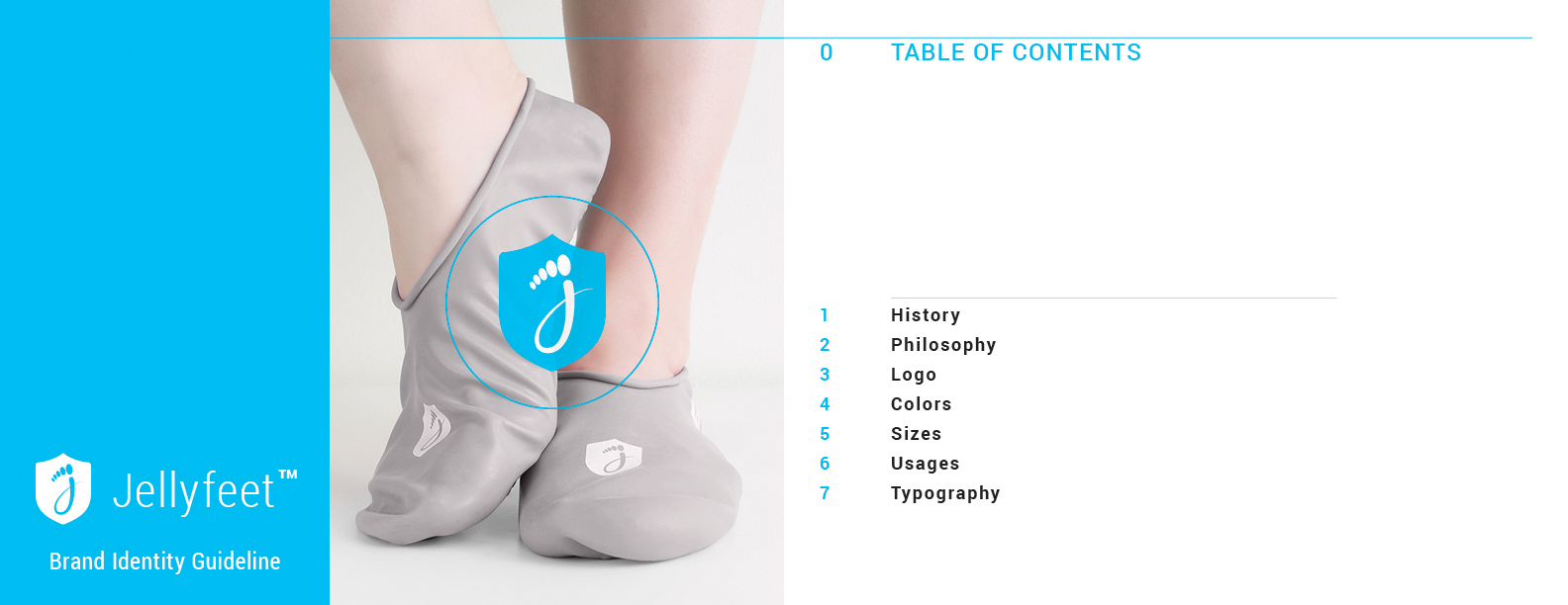
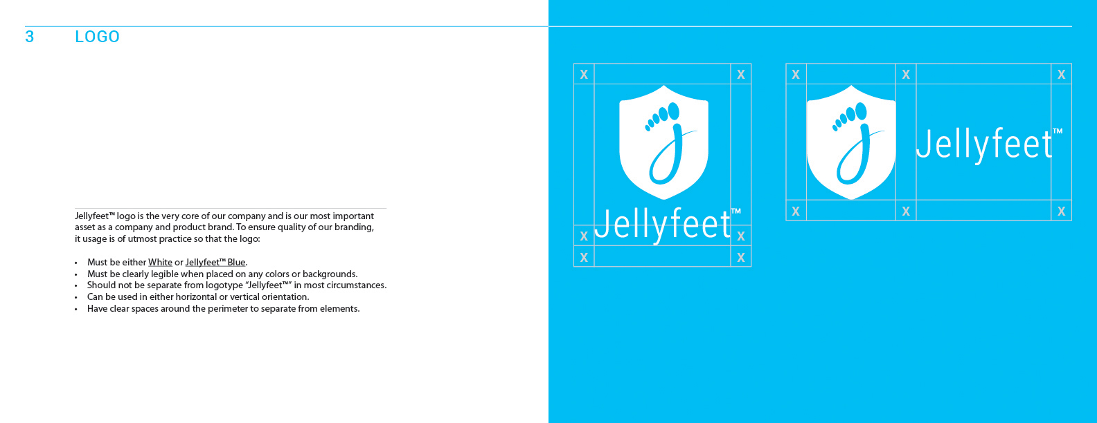
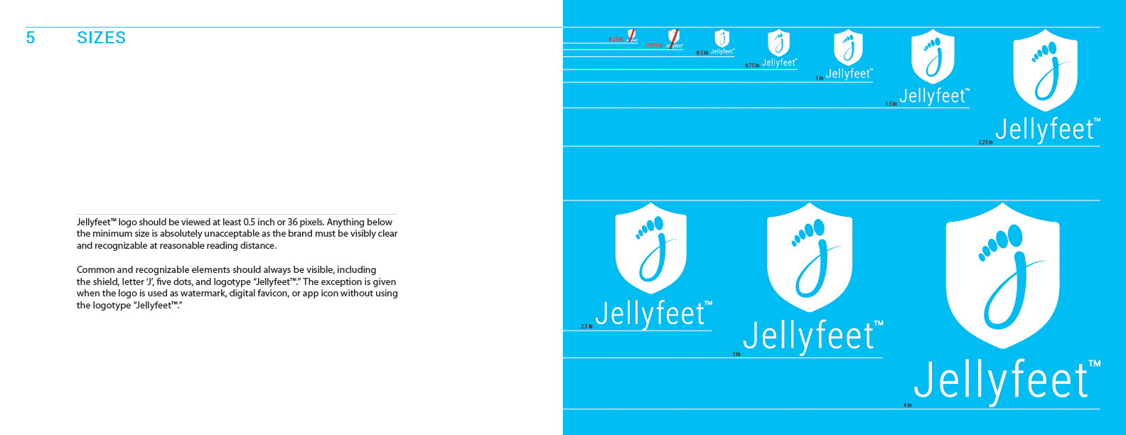
Redesign of existing foot-cover brand in podiastry product market. The shield represents the time-tested reliabilty and quality of foot protection, highlighted with the symbol of foot branding with five dots atop the cursive letter "J" .

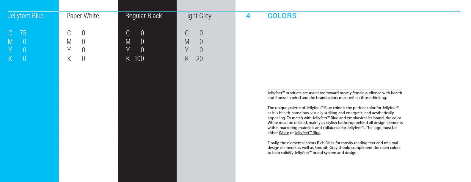
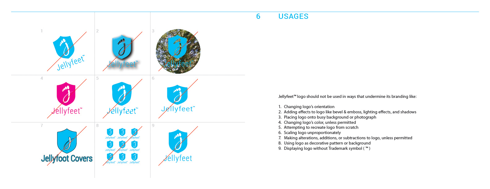
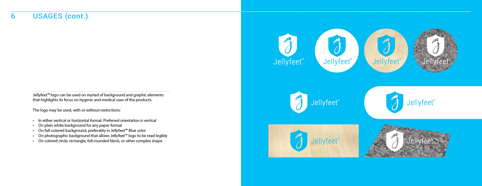
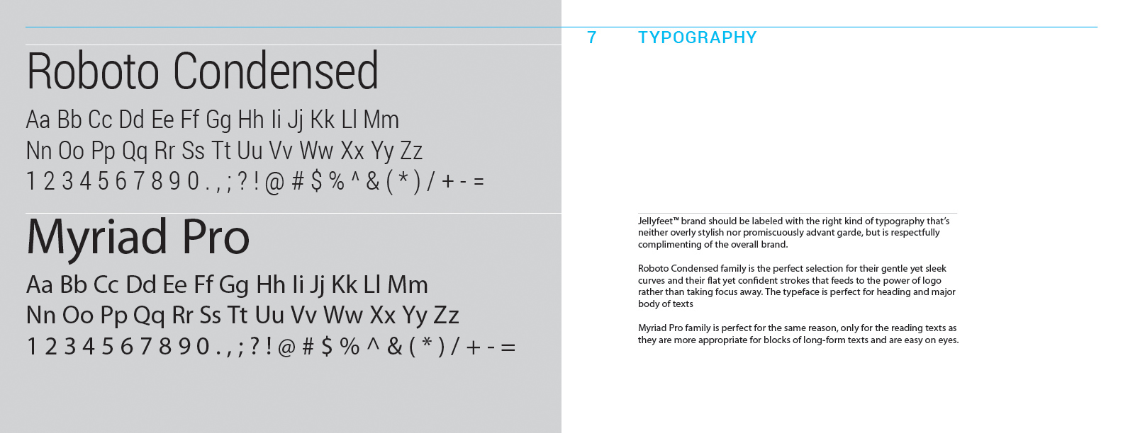
The new brand, refreshed in early 2016, focused on establishing a familiary imagery of foot along with sensible idea of protection. Careful consideration were made for all colors, typography, elements, and compositional styles to help refresh the company's visual presentation as well as highlighting its ongoing mission to protect feet from harsh elements.


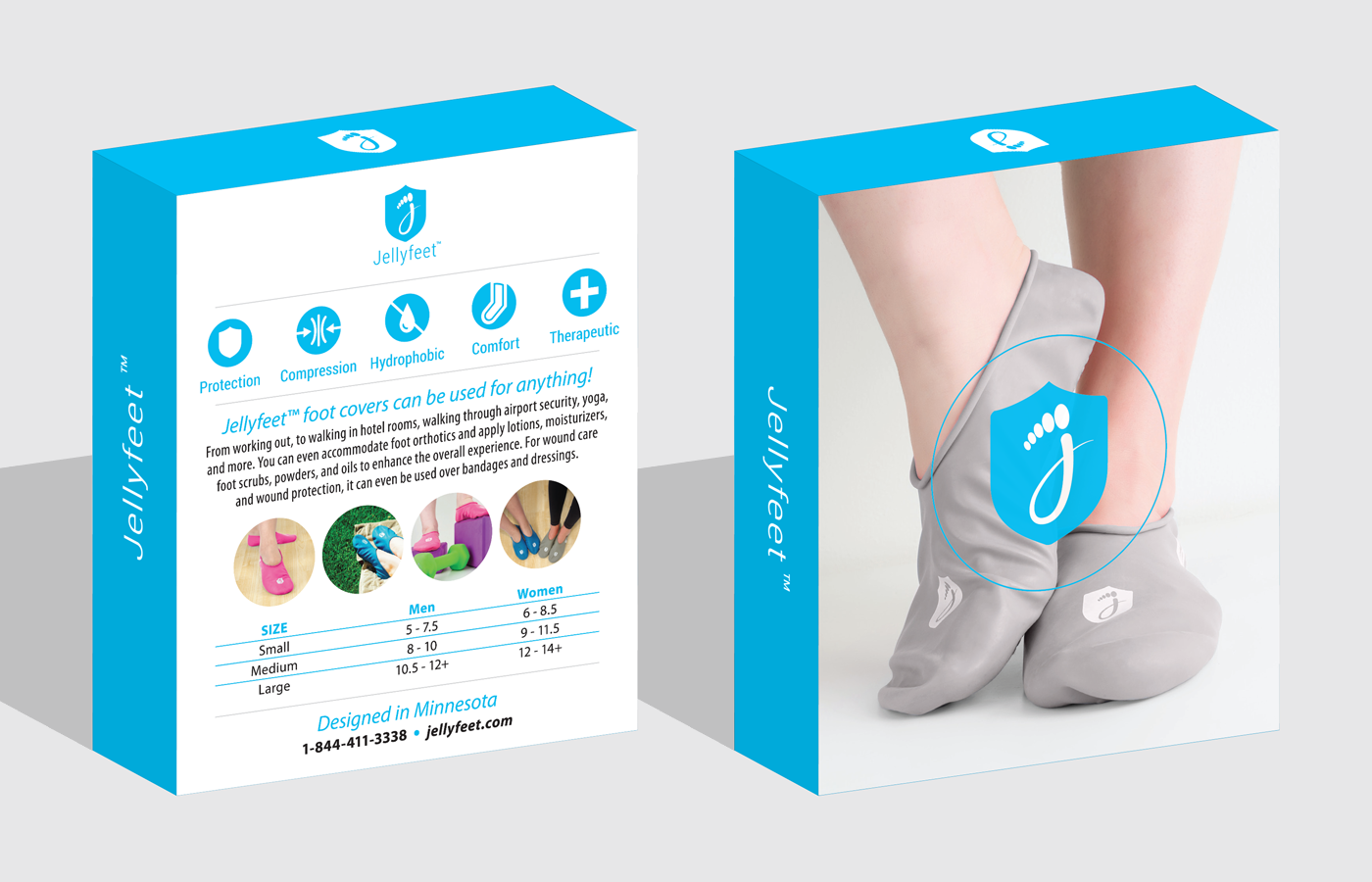
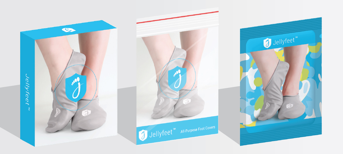
A simple, pleasing, and minimalist packaging was developed with inspiration from Apple-based products because their famously iconic design emphasising quality, fasion, and functionality. The clean design with vibrant colors successfully highlight Jellyfeet's mission to provide protective foot covers that are both fashionable and functional. The design can be applied and adjusted for other form of packaging, such as plastic zip and foil bag.
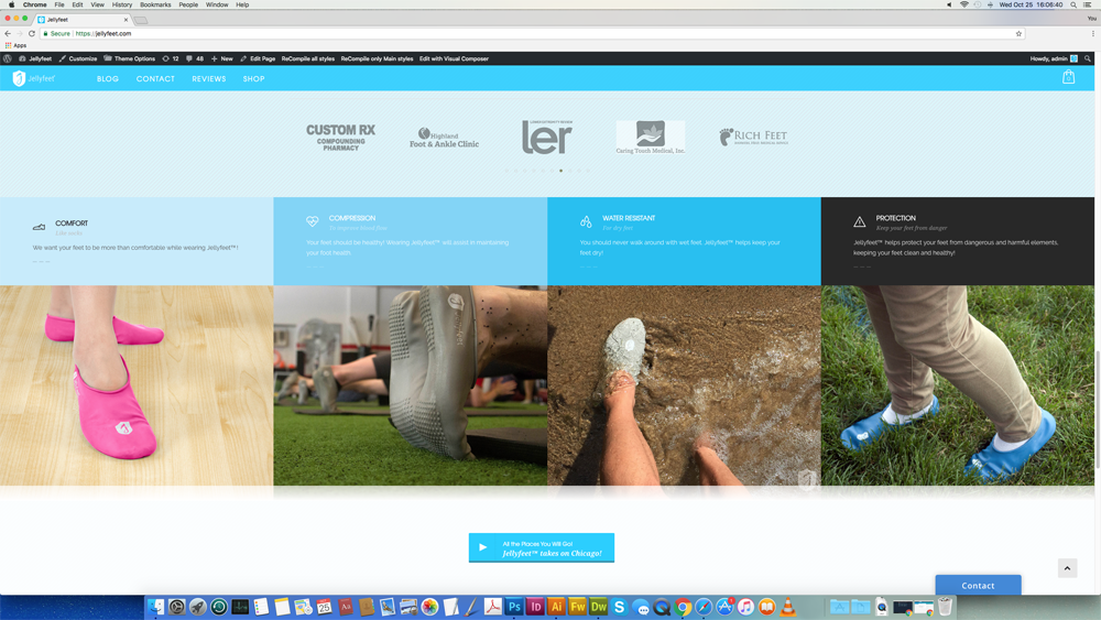
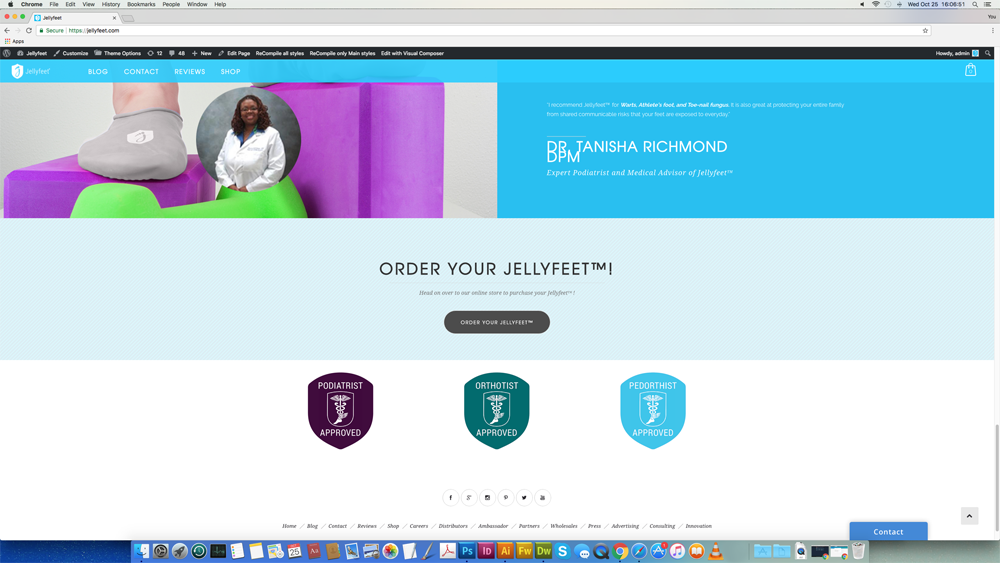
Jellyfeet website was developed to reflect the overall brand system to allow for simple, frustration-free navigation that guide user to learn more about Jellyfeet as well as encouraging to either shop for new products or engage with other people about their iconic foot products.

